You must log in or register to comment.
Ah yes, because what was wrong with Google was their logo was old.
Look we fixed it, everything is better now.
Didn’t even notice. Honestly, wouldn’t have noticed if it wasn’t pointed out for me.
google blurring lines again.
so what’s new?
Google really loves to change logos/icons of their stuff.
Looks better tbh.

Huh
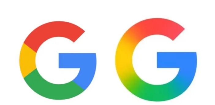
I can’t see the photo but the logo change was just a blend of the colors next to each other instead of lines. Old on left…

I wonder how much they paid their design team to use the surface blur tool on their logo lol
and to make people confused by using the almost same icon for every app they have
Yes, the app icons are horrible. You can’t “scan” them anymore at a glance. They all just look like exploded clown.


