

Ofc its youtube,they cannot make a good UX sometimes even UI
“Oh no, a platform with options, why would anyone want options?”
Go buy a MacBook if you like basic functions. Yt music is getting closer to old fashioned but amazing Winamp. I praise them for it. With one menu button you have all the options 1 click away. No submenu’s, no 5 different menu’s, just one with everything. How can you complain about this? I’d say that’s mild infuriating. “oh look, a platform is doing something right, let’s make fun of them because I just wat a play and pause function and nothing more.”
Don’t think OP is complaining about the number of options so much as how they are presented.
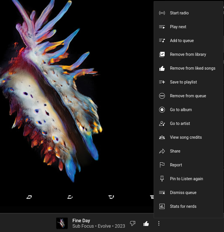
That menu looks much taller than it needs to be, the spacing between lines is huge, and the icons are unnecessarily big too.
Might not be what OP meant, but that’s how I read it.
EDIT - upon reading down the thread, it looks like it IS the number of options, my bad, sorry.
The size of the menu makes it easy to recognize (with the icons) to find the option you want. The small windows menus can be really long and always makes you read half of it to find the one you need. The only option I would like to see added (as stated by someone else here in the comments) is the “stop after current song”.
I guess it’s a matter of taste - I find a menu that tall, with gaps that large between the items, harder to read than a more compact presentation of the same info.
Either way though, it doesn’t seem like that was the issue, so not to worry!
I’m also appreciating how easy it is to navigate given the context. It has everything you need to find what you want at a glance: good spacing, clear icons, and sorted in the order I’d most likely expect. It could use a couple separators, though, or maybe extend the layout to two columns like a start menu.
I don’t see the problem besides the jump scare of expecting a smaller menu.
Shut up. Seriously. If any frontend designer hears you, the next thing you know is that you need to click through 4 submenus just to skip a song ‘bEcAuSe UsErS gEt CoNfUsEd WhEn ThEy SeE tOo MaNy OpTiOnS’
Well, I’ve studied human-machine interaction and indeed too many options can affect a user’s interaction with the program. Don’t seem to recall the exact numbers, but there is a range to the optimal number of options in a menu. 5 to 7 options, maybe? Too many options, iirc, increase the time they take to process the options, even in menus they might be familiar with.
Not ideal: one huge menu with all options inside.
Also not ideal: too many small submenus.
Find a balance. Not all vertical, but also not all horizontal, nested menus
If I find the material, I’ll update the comment.
Edit: Hick’s Law
Edit 2: 8 is the limit for pie menus. Otherwise, options get too small.
Width is preferred over depth in cascading menus. I think it’s about 15 to 20 options per menu
I disagree. Who needs a special item called “Stats for Nerds” hanging in there? Nerds know how to enable them in the app settings.
What really bugs me about this menu is that they keep rearranging the items and I need to search where the hell “Save to Playlist” went again. And I often confuse “Save to Library” and “Save to Playlist”, because isn’t that like the same thing, but called different?
YouTube Music’s UI is getting increasingly messy and frustrating.
deleted by creator
YES! But only if they gimme back the songs and albums I’ve purchased for 0 monies back in the day. Had them as files on my pc, but lost them in poor last minute backups prior to reinstall. Had some big names, full albums, for free, in my collection
What really bugs me about this menu is that they keep rearranging the items and I need to search where the hell “Save to Playlist” went again. And I often confuse “Save to Library” and “Save to Playlist”, because isn’t that like the same thing, but called different?
Rearranging is an issue.
Hard disagree.
There’s at least a handful of items there that can be tucked away and wouldn’t be missed 99% of the time. The rest can be split in two groups without requiring additional clicks and cutting down time.
I loathe when I need to go through a dozen things in a menu because no one bothered to establish a relevance criteria, and I’m not even dsylxeic
This is the opposite of infuriating. Do you know what is? Having to poke around all four corners and then scroll down to figure out where the latest update moved the shit I’m looking for. This isn’t very clean I’ll give you that. But it’s still 1000% better than buttons all over the place.
And then it will be somewhere completely illogical. Like, the theme settings are under ‘privacy’ or some such nonsense.
They keep adding and rearranging the menu items though, so I still have to look where they put the shit I’m looking for again. Not as annoying as burying the stuff behind a thousand dropdowns, but…mildly infuriating. :D
Alright you make fair points. Easier than multiple menus but yeah, why the hell do they keep rearranging? It feels like an engagement mechanism to make you spend just a second longer on the page or accidentally click something else due to muscle memory.
And still doesn’t have a ‘for god’s sake never play this artist ever again’ button
really want that too
Definitely ways they could make that cleaner.
-
Remove from queue: have this as an option only from the queue itself, not from the song currently playing.
-
Go to: merge into a single “Go to…” button, press it for a submenu listing Artist/Album/Song Info
-
Report: Useless. Vet your own shit, Google.
-
Pin to Listen Again: Just use “liked songs” like a sane person.
-
Dismiss queue: same as remove from queue.
-
Stats for nerds: should only be visible with an advanced or developer option in the app settings.
Also remove from liked songs. Just click the like button again to do it.
Go to as a sub menu is worse, just allow clicking the album/artist name and add an info icon button for more song info.
Even better
-
And they are still missing the most important menu item “Stop after this track”
wrong
that’s what the menu is for, showing us the other options
I don’t want to have to dig for something that should just be in the menu


